In Modern SharePoint sites, a “Quick Chart” web part now has the ability to pull data from a SharePoint list.
| Add the “Quick Chart” web part from the edit menu. |
*My preference is using the One-third width section layouts.
 |
Select the pencil icon to edit the “Quick Chart”. |
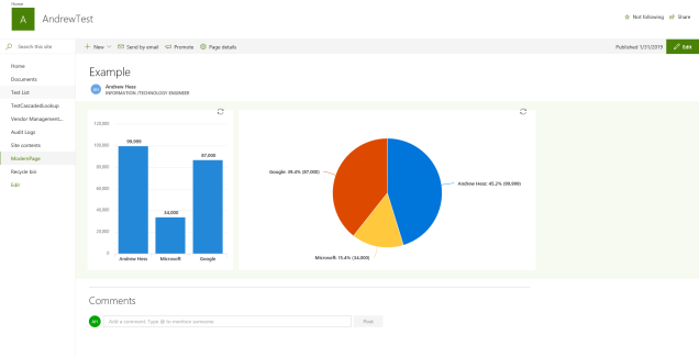
There are currently 2 types of charts currently available the Column Chart and the Pie Chart.
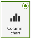 |
The column chart can show data changes over time or comparisons. Categories are shown along horizontal axis and values along the vertical access. |
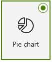 |
The pie chart is used to show percentages of a whole and recommended with fewer than seven categories. |
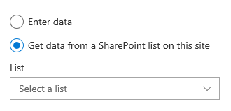
Under the Data section select – Get data from a SharePoint list on this site
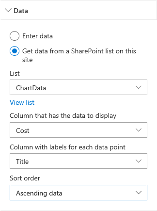 |
Select a Number column that has the data to display.
Then select a Text type column to display the labels. Configure the Sort order if necessary. |
Now your data can be read in a dashboard on any Modern Page.

Only 50 items will be displayed the list and there are limitations to columns that can be selected.
LikeLiked by 1 person
In SharePoint 2019 the option of List is removed 😦
LikeLiked by 1 person
Hi cpu, I am just assuming that this is due to the patch that your version of SharePoint is currently running on. As soon as your SharePoint Admin runs a cumulative update on your servers, I would think you would see the option. SharePoint Online should be a little ahead of SharePoint on-premises.
LikeLike
The Quick Chart is very limited (no aggregations, no filtering). This commercial alternative gives those options without needing to resort to the expenditure involved in PowerBI: https://www.365automate.com/charts
LikeLiked by 1 person
Thanks for sharing Johnny
LikeLike